00[1] 0This is an R markdown document. Here we can mix text with code, which is helpful while analysing data. It allows you to add your thoughts to the code and keep a record of observations and ideas. To add a code section (chunk) you can press CTRL + ALT + I.
00[1] 0To run one line of the code, you can place the cursor on that line (or you can highlight the line) and press CTRL + Enter. To run the whole chunk, place the cursor anywhere in the code chuck, and press CTRL + Shift + Enter.
We can also render this document as an HTML page, a pdf or a Word document.
# ---Basic data types--- #

# This is my favourite number
my_favourite_number <- 10

# These are all the numbers that I know
numbers_i_know <- 1:10

# We don't just work with numbers, we also work with letters and words. These are called strings
immoral <- "pinapple on pizza"

# Often, for our analysis, we want to work with multiple variables and store them in an "Excel spreadsheet".
# The equivalent of this in R is a data frame.
# NOTE: All data frame columns must have the same length. Each column can contain only one data type
my_numbers <- data.frame(
    "numbers_i_know" = 1:10,
    "number_i_dont_know" = 11:20
)
Once we have a vector or a data frame, how can we access and use its values?
```{r}
# To access a value from a vector, we use the squared brackets [], passing the position of the value we are interested in.
# For instance, if we are interested in the 5 value that I know
numbers_i_know[5]

# If I want to know the first three numbers that I know
numbers_i_know[1:3]

# We can also add a value to a vector by using, as an index, the length of the vector plus 1.
# I just learnt the number 11!
numbers_i_know[11] <- 11

# For data frames, as we work with 2-dimensional data (rows and columns), we must index both rows and columns.
# To do so we use dataframe_name[rows_idx, columns_idx].

my_numbers[5, 2]
my_numbers[5:8, 1:2]
my_numbers[5:8, ] # This is equivalent to the line above

# If we are interested in extracting all the values in a specific column of a data frame, we can use three methods.
# We show them by extracting the first second of our data frame
my_numbers[ , 2]
my_numbers[["number_i_dont_know"]]
my_numbers$number_i_dont_know

# If you wonder whether we can do the same for strings, the answer is NO.
# In that case we need to use a specific function, `substr`. We won't use this today.
# You can check how to use use it typing: ?substr in the console
```
In the past two days, we have seen how loops (especially for loops) are pretty handy in Python. We will now learn how to use loops in R. However, you should be aware that you will hardly see any for-loop in R code. The reason why is that there are a bunch of functions that do the same job but usually in a “safer” and faster way.
for (i in 1:10 ) {
    # Square each value from one to 10
    print(i**2)
}
[1] 1
[1] 4
[1] 9
[1] 16
[1] 25
[1] 36
[1] 49
[1] 64
[1] 81
[1] 100# Create an empty vector were we will add the results of each iteration of the for loop
results_vector <- c()
# Create a for loop that goes over every value in the "numbers_i_know" column of our dataframe and computes its square root
for (i in 1:nrow(my_numbers)) {
results_vector[i] <- sqrt(my_numbers[i, 1])
}
# Print the results
results_vector [1] 1.000000 1.414214 1.732051 2.000000 2.236068 2.449490 2.645751 2.828427
[9] 3.000000 3.162278If you are curious about how the this for loop could be re-written without using the loop, here is an example
# Through vectorization
results_vector <- sqrt(my_numbers$numbers_i_know)

# Using the lapply function (not the best use tbh, but it's an example)
results_vector <- sapply(my_numbers$numbers_i_know, sqrt)Imagine you want to run a linear regression on your data using R. There are two ways to do so. The first is to code the linear regression by yourself, step-by-step, line-by-line. This would be highly time-consuming, and for more advanced techniques, we could also have difficulty understanding how to implement them correctly. The second way is to exploit the hard work of others who took the time to write the functions we need and decided to share them for free. These functions usually do not come alone but ship inside packages. You can think of packages as boxes containing different functions, data, and information that are typically created for a specific purpose.
The first thing you need to do to use a package is to ask R to ship it to your computer for free - aka, we need to install it. We use the function install.packages("name_of_the_package_here") to do this. Once your package has been installed, you have to open it and extract all the functions and data it contains. You do this through the function library(name_of_package_here). It would help if you did this in every script you write, usually at the beginning of the script.
We now “open” (load) the packages that we will need now
# If it is the first time you use a package, you need to install it first.
# install.packages(c("tidyverse", "janitor"))

# Loading required packages
library(tidyverse) # For plotting, modifying data sets, and keep everything tidy
library(janitor) # To clean up variable names in data framesThe first thing we need to do is to load the data set.
# Load data set
subtitles_data <- read_csv("datasets/subtitles_corpus.csv")
This data set contains information about how many times words appear in the subtitles of 32 movies. We created this data set by:
You can recreate this data set by following our script on Github.
Now, if you look closely at the variables, you’ll see that the names are all over the place. Letters are a mix of upper and lower case. Dots and spaces are used as separators. What is …1 even supposed to be? This is bad…
Although this is an exaggerated example, if you work with data sets for a while, you’ll encounter things that will give you nightmares. The first thing we want to do is clean up this a bit. To do this, we use:
# Standardise the variable names with the function `clean_names` from the `janitor` package
subtitles_data_clean <- clean_names(subtitles_data)
Look at the results (you can use colnames(subtitles_data_clean) for this:
sprintf("Column names before janitor: %s, %s, %s, %s, %s", colnames(subtitles_data)[1], colnames(subtitles_data)[2], colnames(subtitles_data)[3], colnames(subtitles_data)[4], colnames(subtitles_data)[5])[1] "Column names before janitor: ...1, Word, Frequency_Counts, normalised.Frequency, Movie"sprintf("Column names after janitor: %s, %s, %s, %s, %s", colnames(subtitles_data_clean)[1], colnames(subtitles_data_clean)[2], colnames(subtitles_data_clean)[3], colnames(subtitles_data_clean)[4], colnames(subtitles_data_clean)[5])[1] "Column names after janitor: x1, word, frequency_counts, normalised_frequency, movie"To proceed with the analyses, it’s important we take some time to understand the meaning of each column. What data do they contain? What do their values represent? Generally, to answer these questions, you need to look for a metadata file that comes with the data set (hopefully), or you need to contact the creator of the data set. As a heads up, when you are the person creating a data set, please keep track of all the relevant information in a text file. This information is crucial not only if other people need to work with your data but also for your future self. Remembering all the data details after a while of not working on it is challenging. Do your future self a favour and create a metadata file for every data set you work with. Here is a breakdown of the data set.
x1: This is an index column that was automatically created by Pandas, a Python library used to work with data frames in Python. The values are akin to the row numbers and can be useful in Python. Here, we do not really need them.word: single word (or token) included in a subtitlefrequency_counts: how many times the word appears in the subtitle for each movienormalised_frequency: this is the absolute_frequency divided by the total number of words that appeared in a moviemovie: an anonymous label indicating which movie each row refers toFor the following analysis, we are really interested in three variables: word, title and normalised_frequency, so let’s select them and remove the other two.
# Select the first two columns by slicing the data frame.
subtitles_data_reduced_columns <- subtitles_data_clean[ , c(2,4,5)]

# Can you think of different ways to do this? Maybe using the column names?You might have noticed that we have just modified the same data set over and over in different lines. This is not a problem, really, but it would be nice to have a way to write the same code a bit cleaner. In real life, you might have to do way more processing steps than we have done here, and having a nice and clean syntax will help you avoid possible errors. And guess what? There is a cleaner way to do all of this, and it’s called pipe (%>%).
# Here we concatenate all the functions/steps we did before
subtitles_data <- read_csv('datasets/subtitles_corpus.csv') %>%
    clean_names() %>%
    select(word, normalised_frequency, movie)
Note: usually, you want to load the data separately rather than pipe it straight away. There are a couple of reasons for this: (1) you usually need to know what operations you have to apply to the data; (2) you want to keep a copy of the original data as a reference in case you need it later.
Words, words, words… there are too many words in our data set. Look at it, there are more than 300.000 rows. The issue is that most of the words here appear just a few times and are not really interesting to us. For instance, the word aback constitutes only the \(0.02 \%\) of the subtitles for the movie Summer of Soul and does not appear in any other movies. Moreover, there are a bunch of words that were not fully cleaned up when we created this data set (e.g. aaah or the classic aaagh from *Nightmare on Elm Street).
For reasons that will become clear later, we are interested only in the following words: gravity, space, spacetime, alien, aliens, mayday, communication, earth, mission, missions, star, stars, planet, drink, horse, bounty, guns, gun, buck, bucks, texas, canyon, canyons, christmas, children, bells, cold, north, pole, and chocolate. A bit weird, I know, but bear with us. The first thing we want to do is to select only the rows containing these words. In other words, we want to filter our data set and capture only the information we need. To do so, we can use our pipe to apply the function filter to the data set. This function (contained in the dplyr package loaded within tidyverse) allows you to subset rows on the basis of some rule we want to apply. Here, our rule will be that the rows we want to retain must contain a word that is included in a list of words we are interested in. We will first create the list and then use the filter function.
# Create a vector of words we want to select
interesting_words <- c('gravity', 'space', 'spacetime', 'alien', 'aliens',
                       'mayday', 'communication', 'earth', 'mission', 'missions',
                       'star', 'stars', 'planet', 'drink', 'horse', 'bounty',
                       'guns', 'gun', 'buck', 'bucks', 'texas', 'canyon',
                       'canyons', 'christmas', 'children', 'bells', 'cold',
                       'north', 'pole', 'chocolate')
subtitles_filtered <- subtitles_data %>%
    filter(word %in% interesting_words)
Note how elegantly you can read the filter function. It’s basically plain English. Yup, the %in% is a bit strange, but it’s easy to understand what it means.
You can see that the new subtitles_filtered data set contains 1035 rows. This is because there are 45 movies, and we selected 26 words: \(12 \cdot 32 = 384\).
If you read the list of words, you might notice that they are not fully random. There are some themes, and words can be grouped into three categories. With a bit of creativity, we can call these categories:
What we need to do now is to sum the frequencies of these words to obtain a value for each category and each movie. For example, for movie A, we want to get a Life score, which is the sum of the normalised frequencies of the words because, people, world, water. In doing this, we will review the use of the filter function, introduce the concept of groups, and see how to obtain summary values from our raw data.
space_data <- subtitles_data %>%
    # Step 1: Filter the data to select only the words in the LIFE category
    filter(word %in% c('gravity', 'space', 'spacetime', 'alien', 'aliens', 'mayday', 'communication', 'earth', 'mission', 'missions', 'star', 'stars', 'planet')) %>%
    # Step 2: Create a grouped data set. All the functions piped after this line
    #         will be independently applied to each movie title
    group_by(movie) %>%
    # Step 3: Summarise the normalise frequencies by summing them. Remember, the
    #         sum is computed for each movie title independently and we are
    #         adding up the frequencies of the four words filtered before.
    summarise(frequency_space = sum(normalised_frequency))
The resulting data set contains 32 observations (rows), one for each movie.
| movie | frequency_space |
|---|---|
| movie_1 | 0.0014933 |
| movie_10 | 0.0232435 |
| movie_11 | 0.0000000 |
| movie_12 | 0.0004040 |
| movie_13 | 0.0166520 |
| movie_14 | 0.0009900 |
| movie_15 | 0.0003490 |
| movie_16 | 0.0007840 |
| movie_17 | 0.0000000 |
| movie_18 | 0.0065967 |
| movie_19 | 0.0006010 |
| movie_2 | 0.0000000 |
| movie_20 | 0.0007500 |
| movie_21 | 0.0083907 |
| movie_22 | 0.0115207 |
| movie_23 | 0.0015841 |
| movie_24 | 0.0017746 |
| movie_25 | 0.0033361 |
| movie_26 | 0.0003870 |
| movie_27 | 0.0175656 |
| movie_28 | 0.0003760 |
| movie_29 | 0.0012300 |
| movie_3 | 0.0022026 |
| movie_30 | 0.0005240 |
| movie_4 | 0.0003850 |
| movie_5 | 0.0014550 |
| movie_6 | 0.0117051 |
| movie_7 | 0.0011910 |
| movie_8 | 0.0005040 |
| movie_9 | 0.0004830 |
Now repeat the same for the swear and humanity category.
# SWEAR DATA
west_data <- subtitles_data %>%
    #filter(word %in% c('really', 'sorry', 'thank', 'thanks', 'sex', 'woman')) %>%
    filter(word %in% c('drink', 'horse', 'bounty', 'guns', 'gun', 'buck', 'bucks', 'texas', 'canyon', 'canyons')) %>%
    group_by(movie) %>%
    summarise(frequency_west = sum(normalised_frequency))

# HUMANITY DATA
winter_data <- subtitles_data %>%
    filter(word %in% c('christmas', 'children', 'bells', 'cold', 'north', 'pole')) %>%
    group_by(movie) %>%
    summarise(frequency_winter = sum(normalised_frequency))
Fantastic! We now have three data sets containing, for each movie, a score (sum of frequencies) indicating the proportion of subtitles covered by each of the three categories we have created. The last step in our data preparation is to put all the data back into one data set. Please welcome the cbind function on stage!
category_data <- cbind(space_data, west_data[,'frequency_west'], winter_data['frequency_winter'])| movie | frequency_space | frequency_west | frequency_winter |
|---|---|---|---|
| movie_1 | 0.0014933 | 0.0009960 | 0.0542558 |
| movie_10 | 0.0232435 | 0.0005280 | 0.0010565 |
| movie_11 | 0.0000000 | 0.0009680 | 0.0058031 |
| movie_12 | 0.0004040 | 0.0008080 | 0.0521005 |
| movie_13 | 0.0166520 | 0.0004270 | 0.0019210 |
| movie_14 | 0.0009900 | 0.0012360 | 0.0027198 |
| movie_15 | 0.0003490 | 0.0006980 | 0.0345664 |
| movie_16 | 0.0007840 | 0.0172546 | 0.0011765 |
| movie_17 | 0.0000000 | 0.0019504 | 0.0000000 |
| movie_18 | 0.0065967 | 0.0000000 | 0.0019793 |
| movie_19 | 0.0006010 | 0.0006010 | 0.0426430 |
| movie_2 | 0.0000000 | 0.0010699 | 0.0046366 |
| movie_20 | 0.0007500 | 0.0097451 | 0.0014992 |
| movie_21 | 0.0083907 | 0.0000000 | 0.0006990 |
| movie_22 | 0.0115207 | 0.0011521 | 0.0000000 |
| movie_23 | 0.0015841 | 0.0001980 | 0.0132673 |
| movie_24 | 0.0017746 | 0.0039036 | 0.0003550 |
| movie_25 | 0.0033361 | 0.0016680 | 0.0000000 |
| movie_26 | 0.0003870 | 0.0143027 | 0.0015466 |
| movie_27 | 0.0175656 | 0.0000000 | 0.0021957 |
| movie_28 | 0.0003760 | 0.0090128 | 0.0026295 |
| movie_29 | 0.0012300 | 0.0024600 | 0.0000000 |
| movie_3 | 0.0022026 | 0.0044053 | 0.0022033 |
| movie_30 | 0.0005240 | 0.0141507 | 0.0034067 |
| movie_4 | 0.0003850 | 0.0000000 | 0.0354528 |
| movie_5 | 0.0014550 | 0.0020382 | 0.0002910 |
| movie_6 | 0.0117051 | 0.0000000 | 0.0006330 |
| movie_7 | 0.0011910 | 0.0015884 | 0.0007940 |
| movie_8 | 0.0005040 | 0.0020141 | 0.0060428 |
| movie_9 | 0.0004830 | 0.0019305 | 0.0000000 |
cbind stands for column bind and it’s a function you can use to merge data frames or vectors side-by-side. Here, we merged the life data with the frequency_swear and frequency_humanity columns from the other data frames. The reason for selecting only one column from the swear and humanity data frames is that we do not want to repeat the ‘title’ column three times. However, please note that before merging, you want to ensure the titles are in the same order across all three data sets! Otherwise, we will end up mixing up the values!
Quick thinking question for you: What function do you think we should use to merge data sets vertically, one on top of the other?
The data is clean, and we are ready to do some analysis. Or are we? We believe starting by visualising the data is more useful and educational. There are multiple reasons for this:
Having said this, let’s put the analysis on hold and focus on plotting. Specifically, we will use the ggplot package contained in the tidyverse bundle. ggplot is an amazing and powerful package for creating beautiful, informative, and publication-worthy plots and visualisations. How ggplot works follows a specific philosophy expressed in the book The Grammar of Graphics. Because of this, it requires a particular structure that, although logical and clean, usually takes some time to learn. So, our goal today is to break down this structure and show you its power.
To foreshadow the next section, this is what we will create. It takes 5 lines of code…nothing more.

Imagine you decide to learn how to paint. You have bought all the material and selected a subject. Now what? What is the very first thing you need to do? Well, you need to prepare the canvas. In painting, you must prime your canvas with some gesso. Thankfully, we don’t need to deal with that messy, sticky thing in coding. Our canvas is an empty window, and our primer is the coordinate system (axes) where we will plot the data. We can create the window and the axes with one line using the function ggplot. Yup, ggplot is the package’s name and the function you will always use to start a new plot.
# ---Create a blank canvas with axes for our plot--- #

# We start by selecting the data set we need to plot
category_data %>%
    # Then we pipe (pass) this to the ggplot function because it needs to know where the data comes from
    ggplot(aes(x = frequency_space, y = frequency_west))
If you run this code, you see an empty plot with only the axes and their labels. Note the argument aes we used inside the ggplot function. This is short for aesthetics. Inside aes, we define all the elements of the plot that refer to the axes, grouping, colour, etc… We will see more on this soon.
We have primed our canvas, and the gesso is dry. The next move is to draw the subject of our painting. In our example, this will be a scatter plot. ggplot offers many templates for our subjects. These are called geom (short for geometry), and they are like blueprints that can be used to create specific plots. Examples of geoms are:
geom_bar: barplotgeom_line: lineplotgeom_point: point plotgeom_scatter: like a point plot, but the points are shifted left and right to show them allHere, we will use the geom_point to create a violin plot.
# ---Create a blank canvas with axes for our plot--- #

# We start by selecting the data set we need to plot
category_data %>%
    # Then we pipe (pass) this to the ggplot function because it needs to know where the data comes from
    ggplot(aes(x = frequency_space, y = frequency_west)) +
    # Add a point plot through geom_violin
    geom_point()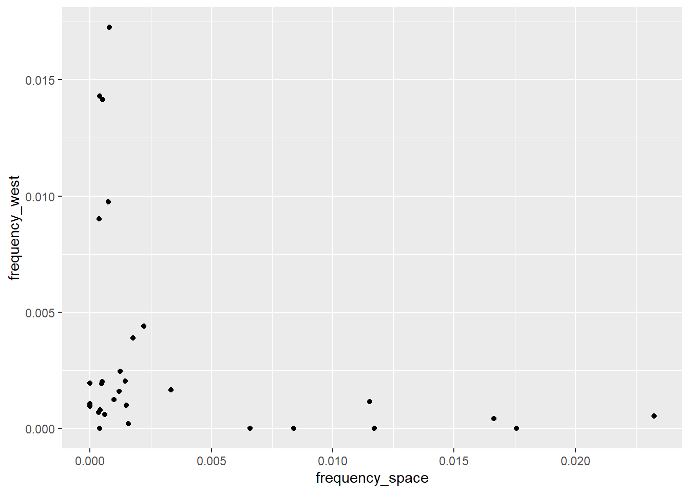
The next step is to change the default labels and add a title for our plot. Contrary to a painting, here we want to guide the viewer as much as possible. As you can see, ggplot automatically uses the variable names contained in the data set as labels (aka the names passed to the x and y arguments in the aes function). We often want to change these, as they are neither nice to read nor informative. Thankfully, we can use a handy layer called labs to change or add labels.
# ---Create a blank canvas with axes for our plot--- #

# We start by selecting the data set we need to plot
category_data %>%
    # Then we pipe (pass) this to the ggplot function because it needs to know where the data comes from
    ggplot(aes(x = frequency_space, y = frequency_west)) +
    # Add a point plot through geom_violin
    geom_point() +
    # Change axis labels and add title
    labs(x     = 'Space',
         y     = 'West',
         title = 'Frequency of Space words as a function of West words')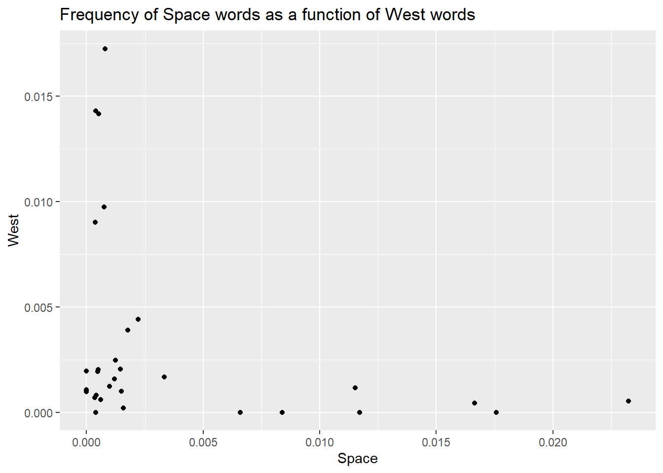
Did you note I called the labs function a layer? There is a good reason for this. In ggplot, you work by stacking elements on top of each other, and each new element forms a new layer. In this case, labels and titles are stacked on top of the plot, just outside the plotting area.
This is an important concept for plotting multiple elements (eg, points and lines) as the order of the layers will affect the final visual result. Just as an example, look at the difference between these two plots. Also, take some time to understand the code, as we’re plotting the same data we have created above. Spend some time looking at pivot_longer, it’s very handy.
long_data <- category_data %>%
    # First we need a long data set so that the three frequency columns are
    # merged into one
    pivot_longer(cols      = !movie,
                 values_to = 'frequency',
names_to = 'category')knitr::kable(head(long_data, 50), format = 'html')| movie | category | frequency |
|---|---|---|
| movie_1 | frequency_space | 0.0014933 |
| movie_1 | frequency_west | 0.0009960 |
| movie_1 | frequency_winter | 0.0542558 |
| movie_10 | frequency_space | 0.0232435 |
| movie_10 | frequency_west | 0.0005280 |
| movie_10 | frequency_winter | 0.0010565 |
| movie_11 | frequency_space | 0.0000000 |
| movie_11 | frequency_west | 0.0009680 |
| movie_11 | frequency_winter | 0.0058031 |
| movie_12 | frequency_space | 0.0004040 |
| movie_12 | frequency_west | 0.0008080 |
| movie_12 | frequency_winter | 0.0521005 |
| movie_13 | frequency_space | 0.0166520 |
| movie_13 | frequency_west | 0.0004270 |
| movie_13 | frequency_winter | 0.0019210 |
| movie_14 | frequency_space | 0.0009900 |
| movie_14 | frequency_west | 0.0012360 |
| movie_14 | frequency_winter | 0.0027198 |
| movie_15 | frequency_space | 0.0003490 |
| movie_15 | frequency_west | 0.0006980 |
| movie_15 | frequency_winter | 0.0345664 |
| movie_16 | frequency_space | 0.0007840 |
| movie_16 | frequency_west | 0.0172546 |
| movie_16 | frequency_winter | 0.0011765 |
| movie_17 | frequency_space | 0.0000000 |
| movie_17 | frequency_west | 0.0019504 |
| movie_17 | frequency_winter | 0.0000000 |
| movie_18 | frequency_space | 0.0065967 |
| movie_18 | frequency_west | 0.0000000 |
| movie_18 | frequency_winter | 0.0019793 |
| movie_19 | frequency_space | 0.0006010 |
| movie_19 | frequency_west | 0.0006010 |
| movie_19 | frequency_winter | 0.0426430 |
| movie_2 | frequency_space | 0.0000000 |
| movie_2 | frequency_west | 0.0010699 |
| movie_2 | frequency_winter | 0.0046366 |
| movie_20 | frequency_space | 0.0007500 |
| movie_20 | frequency_west | 0.0097451 |
| movie_20 | frequency_winter | 0.0014992 |
| movie_21 | frequency_space | 0.0083907 |
| movie_21 | frequency_west | 0.0000000 |
| movie_21 | frequency_winter | 0.0006990 |
| movie_22 | frequency_space | 0.0115207 |
| movie_22 | frequency_west | 0.0011521 |
| movie_22 | frequency_winter | 0.0000000 |
| movie_23 | frequency_space | 0.0015841 |
| movie_23 | frequency_west | 0.0001980 |
| movie_23 | frequency_winter | 0.0132673 |
| movie_24 | frequency_space | 0.0017746 |
| movie_24 | frequency_west | 0.0039036 |
# Boxplots with scatterplot layer on top
box_with_scatter <- long_data %>%
    # Remove winter cause it's distribution ruins the visualisation here
    filter(category != 'frequency_winter') %>%
    # Set up canvas
    ggplot(aes(x = category, y = frequency)) +
    # First layer: boxplot
    geom_violin(aes(fill=category)) +
    # Second layer: scatterplot
    geom_point(position = position_jitter(width=0.1), size=4, alpha=.60 ) +
    # Title
    labs(title = 'Boxplot + Scatterplot') +
    # Change x labels
    scale_x_discrete(labels=c('space', 'west', 'winter')) +
    # Remove legend
    theme_minimal() +
    theme(legend.position = 'none')

# Boxplots with scatterplot layer on top
scatter_with_box <- long_data %>%
    # Remove winter cause it's distribution ruins the visualisation here
    filter(category != 'frequency_winter') %>%
    # Set up canvas
    ggplot(aes(x = category, y = frequency)) +
    # First layer: scatterplot
    geom_point(position = position_jitter(width=0.1), size=4, alpha=.60 ) +
    # Second layer: boxplot
    geom_boxplot(aes(fill=category)) +
    # Title
    labs(title = 'Scatterplot + Boxplot') +
    # Change x labels
    scale_x_discrete(labels=c('space', 'west', 'winter')) +
    # Remove legend
    theme_minimal() +
    theme(legend.position = 'none')

# Show side by side
library(cowplot)   # This should ideally go at the top of the script
plot_grid(box_with_scatter, scatter_with_box)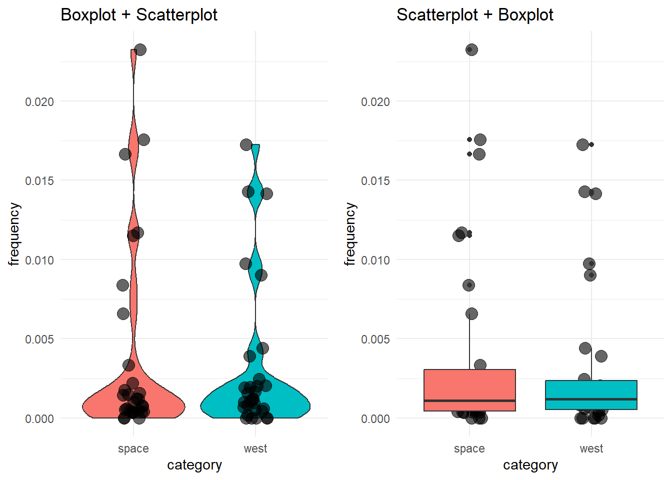
See how the order of the layers in the code affects the final visualization?
Back to where we were. There is one last thing we can do to improve this. I personally don’t like the grey background on the white page. I (Daniele) am more of a minimalist guy, so I will change the default theme to something else. Oh yes…ggplot offers different themes to change the look and feel of your plot! You can access the themes by adding the layer theme_ and completing it with the name of the theme you want (see here for a list and examples).
# ---Create a blank canvas with axes for our plot--- #

# We start by selecting the data set we need to plot
category_data %>%
    # Then we pipe (pass) this to the ggplot function because it needs to know where the data comes from
    ggplot(aes(x = frequency_space, y = frequency_west)) +
    # Add a point plot through geom_violin
    geom_point() +
    # Change axis labels and add title
    labs(x     = 'Space',
         y     = 'West',
         title = 'Frequency of Space words as a function of West words') +
    # Change to a minimalistic theme
    theme_minimal()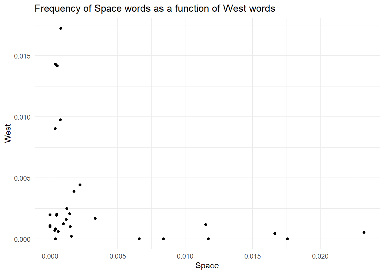
Finally, those points are tiny. No one likes tiny points. We want big, bold points. You can modify the look of most geom by passing some parameters. For instance, geom_point takes a parameter called size, that you can use to change, well…the size of the points.
# ---Create a blank canvas with axes for our plot--- #

# We start by selecting the data set we need to plot
category_data %>%
    # Then we pipe (pass) this to the ggplot function because it needs to know where the data comes from
    ggplot(aes(x = frequency_space, y = frequency_west)) +
    # Add a point plot through geom_violin
    geom_point(size = 3) +
    # Change axis labels and add title
    labs(x     = 'Space',
         y     = 'West',
         title = 'Frequency of Space words as a function of West words') +
    # Change to a minimalistic theme
    theme_minimal()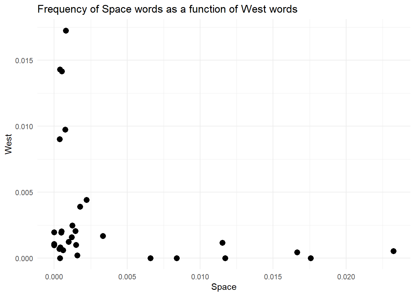
By now, you should have understood that ggplot is all about layering elements on top of each other. This is a great, simple and elegant way to create plots. However, with great power comes great responsibility. You see, ggplot (and computers in general) does not know anything about what you are trying to achieve and the meaning of it. So, you could end up adding meaningless layers to your goals. For instance, we could try to add another layer. Depending on the geom we pick, we could get an error (that’s useful as it helps us avoid mistakes) or ggplot does not complain, and we get something weird like in the plot below. For instance, here, we could add a line that connects all the points.
# We start by selecting the data set we need to plot
category_data %>%
    # Then we pipe (pass) this to the ggplot function because it needs to know where the data comes from
    ggplot(aes(x = frequency_space, y = frequency_west)) +
    # Add a point plot through geom_violin
    geom_point() +
    # Add a line layer because why not?
    geom_line() +
    # Change axis labels and add title
    labs(x     = 'Space',
         y     = 'West',
         title = 'Frequency of Space words as a function of West words') +
    # Change to a minimalistic theme
    theme_minimal()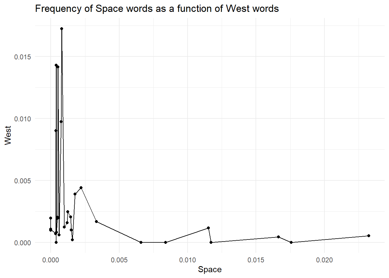
But is it really useful and correct? NO! Our data is categorical; each point is a different movie, and connecting observations is meaningless. Doing so creates a false sense of continuity.
Plotting helps us grasp the data we want to analyse. However, we might want to get some numerical values to summarise our data. In this section, we will view the summarise function a bit more in detail (we used it in the Filtering, Grouping and Summarising) section.
Our goal is to obtain the mean, median and standard deviation of the frequencies for the three groups. One way to achieve this is to work on the three data sets (humanity_data, swear_data and life_data) and compute what we need for each data set individually. For instance, we can get the mean, median and standard deviation of the frequencies in humanity_data with:
mean(space_data$frequency_space)[1] 0.003882603median(space_data$frequency_space)[1] 0.0010905sd(space_data$frequency_space)[1] 0.006132006BOOOORING…
What if we can get all these three values for the three categories while working on one single data set? The idea excites me a lot, so I’ll force you to work on it.
First of all, we have already created a data set that contains information about the three categories. We called it category_data. This is a nice data set, but it’s not the best. You see, the columns frequency_space, frequency_west and frequency_winter represent similar data. Actually, they really represent the levels of a categorical variable that we can call category. In other words, we can think of a variable called category, whose values are frequency_space, frequency_west and frequency_winter. Because of this, we can think of modifying our data set and merging the three frequency columns into one. This means we will end up with a long data set where each movie is repeated three times, one row for each category. Ok, it does not make much sense now, but look at the code below and its output
# Start from the category_data data set
category_data_long <- category_data %>%
    # Now pivot longer: make the data set longer by merging the three frequency
    # columns into one. In doing this we create a column that contains the name
    # of the frequency (life, humanity, swear) and one column that contains the
    # associated values
    pivot_longer(cols      = c(frequency_space, frequency_west, frequency_winter), # What colun to merge together?
                 names_to  = 'category', # Name of the new column where to store the categories
                 values_to = 'frequency' # Name of the new column where to store the frequencies
                 )
I think the best way to understand what happened here is to look directly at the resulting data set. Now, we have a category column containing the names of the initial three frequency columns we pivoted (those columns are included in the cols argument). We also have a frequency column containing the frequency values that were spread across the three columns. Note how each movie is repeated three times.
This way of storing data is called long format and, though initially weird, it’s extremely useful, especially in R, where different functions require the data to be stored this way. Moreover, the data is logically organised: one column for one variable. Once you get accustomed to this format, you will never go back to that large, spread-ed, column-centric, irrational wide format.
| movie | category | frequency |
|---|---|---|
| movie_1 | frequency_space | 0.0014933 |
| movie_1 | frequency_west | 0.0009960 |
| movie_1 | frequency_winter | 0.0542558 |
| movie_10 | frequency_space | 0.0232435 |
| movie_10 | frequency_west | 0.0005280 |
| movie_10 | frequency_winter | 0.0010565 |
| movie_11 | frequency_space | 0.0000000 |
| movie_11 | frequency_west | 0.0009680 |
| movie_11 | frequency_winter | 0.0058031 |
| movie_12 | frequency_space | 0.0004040 |
| movie_12 | frequency_west | 0.0008080 |
| movie_12 | frequency_winter | 0.0521005 |
| movie_13 | frequency_space | 0.0166520 |
| movie_13 | frequency_west | 0.0004270 |
| movie_13 | frequency_winter | 0.0019210 |
| movie_14 | frequency_space | 0.0009900 |
| movie_14 | frequency_west | 0.0012360 |
| movie_14 | frequency_winter | 0.0027198 |
| movie_15 | frequency_space | 0.0003490 |
| movie_15 | frequency_west | 0.0006980 |
| movie_15 | frequency_winter | 0.0345664 |
| movie_16 | frequency_space | 0.0007840 |
| movie_16 | frequency_west | 0.0172546 |
| movie_16 | frequency_winter | 0.0011765 |
| movie_17 | frequency_space | 0.0000000 |
| movie_17 | frequency_west | 0.0019504 |
| movie_17 | frequency_winter | 0.0000000 |
| movie_18 | frequency_space | 0.0065967 |
| movie_18 | frequency_west | 0.0000000 |
| movie_18 | frequency_winter | 0.0019793 |
| movie_19 | frequency_space | 0.0006010 |
| movie_19 | frequency_west | 0.0006010 |
| movie_19 | frequency_winter | 0.0426430 |
| movie_2 | frequency_space | 0.0000000 |
| movie_2 | frequency_west | 0.0010699 |
| movie_2 | frequency_winter | 0.0046366 |
| movie_20 | frequency_space | 0.0007500 |
| movie_20 | frequency_west | 0.0097451 |
| movie_20 | frequency_winter | 0.0014992 |
| movie_21 | frequency_space | 0.0083907 |
| movie_21 | frequency_west | 0.0000000 |
| movie_21 | frequency_winter | 0.0006990 |
| movie_22 | frequency_space | 0.0115207 |
| movie_22 | frequency_west | 0.0011521 |
| movie_22 | frequency_winter | 0.0000000 |
| movie_23 | frequency_space | 0.0015841 |
| movie_23 | frequency_west | 0.0001980 |
| movie_23 | frequency_winter | 0.0132673 |
| movie_24 | frequency_space | 0.0017746 |
| movie_24 | frequency_west | 0.0039036 |
The data is long, the variables are clear, we feel good about ourselves looking at these 96 rows of data, and we’re ready to summarise the data. We do this by applying the summarise function to each of the three categories independently (hint: it’s the time for a group_by):
category_data_long %>%
    # We want the summary statistics for each category
    group_by(category) %>%
    # Summarise lets you compute values (usually summary stats) and produces a
    # new dataframe with only those values
    summarise(average_frequency = mean(frequency),
              median_frequency  = median(frequency),
              std_frequency     = sd(frequency))
# A tibble: 3 × 4
category average_frequency median_frequency std_frequency
<chr> <dbl> <dbl> <dbl>
1 frequency_space 0.00388 0.00109 0.00613
2 frequency_west 0.00317 0.00119 0.00472
3 frequency_winter 0.00913 0.00195 0.0163 Look at that! Look at that! A data set with the summary stats we requested, each one computed on each category independently. To paraphrase an Italian band (Negramaro - Meraviglioso):
but how can you not realize how much the world is wonderful wonderful even your pain could go away then wonderful Look around you the gifts they gave you: they invented for you grouped summary statistics in two lines of code!
Now that our data is cleaned, we are ready to work with it. For this bootcamp, we decided to run a k-means clustering analysis. We made this decision for three reasons:
for-loopsThe core idea of k-means clustering is to take the data and find groups of points that cluster together. Specifically, we want to divide the points into groups based on how similar they are.
What do I mean by similar?
Well, for this analysis, we say that two points are similar and therefore are members of the same group if they are geometrically close to each other. Yup, it’s that simple. If two points lay close to each other in a scatterplot, we can assume they are more similar compared to points that lay far away.
For instance, let’s consider our frequency data and let’s plot Space as a function of Winter. We can see that some points are clustered towards the left and others towards the right of the plot. Maybe we could assume that movies can be divided into two distinct clusters on the basis of how many swear and life words they contain.
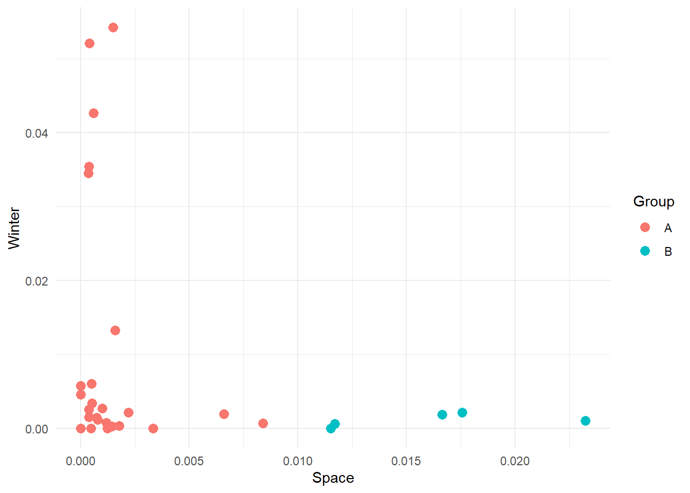
Here we have manually created these two groups, but other groups might be possible. For instance:
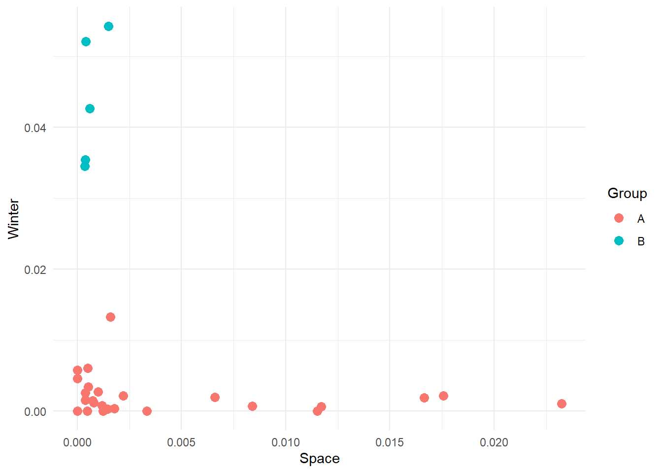
We want to highlight here that there are an infinite number of groups we can create, and we really do not want to do this manually. We want a technique that uses the data and its characteristics (features) to separate the data into clusters. Our job as scientists will be to interpret the meaning of these clusters.
There are multiple techniques to achieve this, but possibly the simplest yet powerful one is kmeans. What kmeans does is try to find cohesive groups of data points so that points in the same group are highly similar while points between groups are highly dissimilar. The algorithm achieves this in a simple and elegant way. So simple and elegant that we are still surprised it works. Here’s a breakdown of the steps:
Run kmeans in R is extremely simple. We can use the kmeans function in the stats package, which is automatically shipped with R (so there is no need to install and load it). We now apply kmeans to our Space-by-Winter data to extract 2 clusters.
# Run a k-means analysis with 2 clusters
km_model <- kmeans(category_data[, c('frequency_space', 'frequency_winter')], centers = 25)
The model should run quickly. Now, we would like to visualise how the points have been clustered. To do this, we need to do some data wrangling. The km_model is a list, as you can see in the Environment pane. Inside it, you can find a lot of different elements, but the one we are interested in right now is the cluster vector. This vector contains a numeric value that indicates which group each point in our data belongs to. We can use this value to colour our point plot to highlight how the points have been divided.
To achieve this, we need to take this cluster vector, attach it to our cleaned data set and plot the points.
# Join the cleaned data set with the cluster vector
cluster_results <- cbind(category_data, "cluster"= km_model$cluster)

# Plot the result
cluster_results %>%
    ggplot(aes(x = frequency_space, y = frequency_winter, colour = as.factor(cluster))) +
    geom_point(size=3) +
    labs(x = 'Space',
         y = 'Winter',
         colour = 'Cluster') +
    theme_minimal()
NOTE: because the algorithm starts by selecting random centroids our results might differ (probably just slightly). This is completely fine and there are ways to address this issue (hint: you can repeat kmeans multiple times and compute how different the final groupings are).
Alright, one more thing before we get to implement this function. Our data contains 3 variables: frequency_space, frequency_west and frequency_winter. Can we use all of them to define cluster the data? That is, can we move from a 2-dimensional to a 3-dimensional plane and cluster the points according to their X, Y and Z coordinates?
Here, each point represents a movie as defined by its space-eness, west-erness and winter-ness. If you move around the plot, you might notice that some movies are high in one specific direction but not others. For instance, some movies contain a high frequency of western-related words, but low frequency of space and winter-related words. Maybe they are western movies? If we run kmeans as we did before but using all three dimensions in our data we get the following:
# Ensure results are repeatable
set.seed(2024)

# 3D kmeans - Note that we selct columns 2 to 4
km_model3 <- kmeans(category_data[, 2:4], centers = 3)
# Add extracted categories to data
cluster_results_3d <- cbind(category_data, "cluster"= km_model3$cluster)
Now we can visualise the results. 3D plotting in R is not part of this tutorial, so we will leave the code but not discuss it.
# Use plotly to 3D plotting (ggplot does not support 3D visualisations)
kmeans3d_fig <- plot_ly(cluster_results_3d,
                        x=~frequency_winter,
                        y=~frequency_west,
                        z=~frequency_space,
                        color=~as.factor(cluster)) %>%
    layout(scene = list(
        xaxis = list(title = 'Space'),
        yaxis = list(title = 'West'),
        zaxis = list(title = 'Winter')
    )) %>%
    add_trace(text       = ~movie,
              hoverinfo  = 'text',
              showlegend = F)
# Display figure
kmeans3d_fig
We requested 3 groups, and we got 3 clusters. Look at how points that are nearby in 3D space are part of the same cluster, while points far apart are members of different clusters. Again, this is what kmeans does at the end of the day.
Can you spot a drawback of this analysis? It requires you to define the number of clusters a priori, and this is not something you always know. Actually, most often, you have no idea how many clusters describe the data the better. It can be 2, 5, 10, 100 or more. And the thing is, kmeans is happy to spit as many clusters as you’d like (there is a maximum for each data set, can you think why and what is it?).
So how do we go about this?
The simplest solution is to run the clustering algorithm multiple times and check how well the groups explain the data. Explain the data? Yeah! Explain the data. The idea is that the points in our data are scattered on our plane - there is variability. By clustering, we want to explain part of this variability by saying, “Hey, the values over here are a bit different, but overall, they look similar. Let’s treat them as a single group”. In practice, we want to find the number of groups that minimise the variance within each group (aka, the observations in one group are very similar). We can maximise this by grouping each data point into its own group…however, this is not really useful. It would tell us that each point is an individual observation. It’s boring and overfitting. The ideal number of groups is the one that maximises the within-cluster variance without adding too many clusters. This way, we ensure that groups are cohesive (represent similar observations), but the model is not overfitted (we leave room for some variability that is inherent in data, especially in psychology).
How do we compute the variance, you might now ask? We’ll use the sum of squares, a commonly used measure of fitness for models.
Let’s write up some code that allows us to run kmeans multiple times with different numbers of groups. We will use a function (we saw them during the first two days in Python) that takes a data set and a maximum number of clusters (K_max) and computes kmeans systematically changing the number of clusters from 2 to k_max. This function will return a data frame containing the sum of square values for each k.
# In R functions are declared as
# function_name <- function(ARGUMENTS) {FUNCTION BODY}

# Note that, conversely to Python, indentation is not important as the beginning
# of the body of the function is defined by the curly brakets {}. However, it's
# still useful to indent code to keep everything nice and clean.

iterative_kmeans <- function(in_data, k_max) {

    # Create a vector to store the within-cluster sum of squares for each iteration
    within_sum_squares <- c()

    # Repeat the clustering changing systematically the number of clusters
    for (iCluster in 2:k_max) {
        # Compute k-means
        current_km_model <- kmeans(in_data, centers = iCluster)
        # Extract within-cluster sum of squares
        within_sum_squares <- append(within_sum_squares, current_km_model$tot.withinss)
    }

    # Create a data frame containing the relevant information
    clustering_data <- data.frame(cbind('sum_of_squares' = within_sum_squares, "clusters" = 2:k_max))

    # Return the data frame
    return(clustering_data)

}
Now, we can use this function to find the optimal number of clusters. If we run the function and plot the sum of squares value for each number of groups, we get a scree plot.
set.seed(27)
# Collect the results and plot them as a scree plot
data_scree <- iterative_kmeans(category_data[, 2:4], 10)

# Plot data
data_scree %>%
    ggplot(aes(x = clusters, y = sum_of_squares)) +
    geom_point() +
    geom_path() +
    labs(x     = 'Number of Clusters',
         y     = 'Sum of Squares (within groups)',
         title = 'Scree Plot') +
    theme_minimal()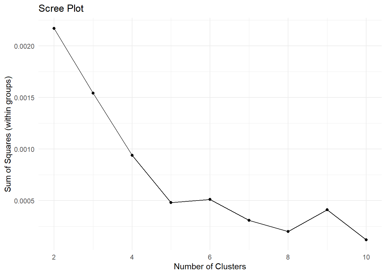
Play around with the number of clusters. Try to increase the maximum number. At some point you will get an error saying Error: number of cluster centres must lie between 1 and nrow(x). Can you understand when you start getting this error? Can you think of the reason why? (hint: what is the maximum number of clusters you can possibly divide data points into?).
Now, the scree plot is a bit of a subjective measure. However, the idea is that the ideal number of clusters is the one where you observe an elbow in the plot. That is, the point after which adding clusters does not reduce the sum of squares that much.
Here, it looks like 5 is the number to go with. So let’s run with it, and let’s divide the data into 5 groups. As we are going to repeat the clustering procedure as we did before, it’s probably time to package the code in a function that provides a data set and the number of clusters; it spits out a version of the data containing the grouping information for each observation.
my_kmeans <- function(in_data, k) {
    # Apply kmeans to the provided dataset
    km_model <- kmeans(in_data, centers = k)
    # Join the cleaned data set with the cluster vector
    cluster_results <- cbind(in_data, "clusters"= km_model$cluster)
    # Return the data set with the results
    return(cluster_results)
}
And let’s apply the function to our data set
# To make results repeatable
set.seed(27)
# Apply function
cluster_results_5 <- my_kmeans(category_data[, 2:4], 5)
# Plot the result
# Note we can plot in 2D and still look at the clusters. This might be useful
# when you have more the 3 dimensions (how do you plot 4, 5 or 1000 dimensions?)
cluster_results_5 %>%
    ggplot(aes(x = frequency_space, y = frequency_winter, colour = as.factor(clusters))) +
    geom_point(size=4) +
    labs(
        x = 'space',
        y = 'winter',
        colour = 'Group'
    ) +
    theme_minimal()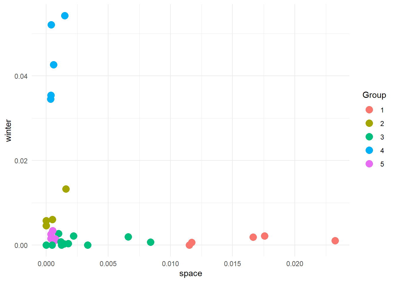
And here are our groups. And now, what do we do?
Do you remember during the first day of the bootcamp that we talked about code as grammar, semantics and pragmatics? Great! So, remember that it is often up to you to interpret and understand the meaning of the results of an algorithm. The algorithm knows nothing about your data, why you want to group it, or even what a group is… The only thing it knows (in this case), is that some points are closer to each other and others are further away. This means you must be pragmatic when looking at the results. You need to use the information available to you to judge if the results are plausible and if they mean anything. Let’s try here.
We know that we have a list of movies that we scored in terms of the frequencies of words related to space, west and winter contained in their subtitles. If we look at the plot below (plot in 3D to ease pragmatics):
kmeans5_fig <-  plot_ly(cluster_results_5,
                        x=~frequency_winter,
                        y=~frequency_west,
                        z=~frequency_space,
                        mode='markers',
                        type = "scatter3d",
                        color=~as.factor(clusters)) %>%
    layout(scene = list(
        xaxis = list(title = 'Winter'),
        yaxis = list(title = 'West'),
        zaxis = list(title = 'Space')
    ),
    title = '5 Clusters')
kmeans5_fig
We see that group 5 is made up of points high in the west dimension, and low in the space and winter dimensions. We could speculate that these are western movies. group 4 is high in the winter dimension and low in the other two. Could these be Christmas movies? It’s time to reveal the true nature of the data set.
Here is a copy of the “de-identified” data showing the movies and their associated titles and categories.
# We have made a copy of these results with the titles of the real titles of the
# movies. We have also stored information about whether the movie is canonically
# described as:
# - SciFi     (s)
# - Western   (w)
# - Chrismtas (c)
knitr::kable(de_identified_movie_data, format = 'html')| frequency_space | frequency_west | frequency_winter | clusters | movie | title | category |
|---|---|---|---|---|---|---|
| 0.0014933 | 0.0009960 | 0.0542558 | 4 | movie_1 | a muppet family christmas | c |
| 0.0232435 | 0.0005280 | 0.0010565 | 1 | movie_10 | gravity | s |
| 0.0000000 | 0.0009680 | 0.0058031 | 2 | movie_11 | home alone | c |
| 0.0004040 | 0.0008080 | 0.0521005 | 4 | movie_12 | how the grinch stole the christmas | c |
| 0.0166520 | 0.0004270 | 0.0019210 | 1 | movie_13 | interstellar | s |
| 0.0009900 | 0.0012360 | 0.0027198 | 3 | movie_14 | minority report | s |
| 0.0003490 | 0.0006980 | 0.0345664 | 4 | movie_15 | miracle on 34st | c |
| 0.0007840 | 0.0172546 | 0.0011765 | 5 | movie_16 | no name on the bullet | w |
| 0.0000000 | 0.0019504 | 0.0000000 | 3 | movie_17 | once upon a time in the west | w |
| 0.0065967 | 0.0000000 | 0.0019793 | 3 | movie_18 | planet of the apes | s |
| 0.0006010 | 0.0006010 | 0.0426430 | 4 | movie_19 | polar express | c |
| 0.0000000 | 0.0010699 | 0.0046366 | 2 | movie_2 | bicentennial man | s |
| 0.0007500 | 0.0097451 | 0.0014992 | 5 | movie_20 | seven men from now | w |
| 0.0083907 | 0.0000000 | 0.0006990 | 3 | movie_21 | solaris | s |
| 0.0115207 | 0.0011521 | 0.0000000 | 1 | movie_22 | space odyssey | s |
| 0.0015841 | 0.0001980 | 0.0132673 | 2 | movie_23 | spirited | c |
| 0.0017746 | 0.0039036 | 0.0003550 | 3 | movie_24 | starwars episode 2 | s |
| 0.0033361 | 0.0016680 | 0.0000000 | 3 | movie_25 | starwars episode 4 | s |
| 0.0003870 | 0.0143027 | 0.0015466 | 5 | movie_26 | the gun fighter | w |
| 0.0175656 | 0.0000000 | 0.0021957 | 1 | movie_27 | the martian | s |
| 0.0003760 | 0.0090128 | 0.0026295 | 5 | movie_28 | the searchers | w |
| 0.0012300 | 0.0024600 | 0.0000000 | 3 | movie_29 | the vast of night | s |
| 0.0022026 | 0.0044053 | 0.0022033 | 3 | movie_3 | blade runner | s |
| 0.0005240 | 0.0141507 | 0.0034067 | 5 | movie_30 | true grit | w |
| 0.0003850 | 0.0000000 | 0.0354528 | 4 | movie_4 | christmas chronicles | c |
| 0.0014550 | 0.0020382 | 0.0002910 | 3 | movie_5 | coherence | s |
| 0.0117051 | 0.0000000 | 0.0006330 | 1 | movie_6 | district 9 | s |
| 0.0011910 | 0.0015884 | 0.0007940 | 3 | movie_7 | dune 1 | s |
| 0.0005040 | 0.0020141 | 0.0060428 | 2 | movie_8 | dune 2 | s |
| 0.0004830 | 0.0019305 | 0.0000000 | 3 | movie_9 | ex-machina | s |
And if we colour movies according to their three canonical categories we get:
Look! The general groups are similar to what we got, with the main genres aligning on different axes. What is interesting, though, is that according to our analysis, there are 5 groups. This means that some movies from various categories have been clumped together. Do you think this is a problem? Possibly, but let’s look at the groups we got to get a better picture and let the data tell us the story. Go back to the 5 clusters we created and check cluster 3. The movies are:
                          title
1               minority report
2  once upon a time in the west
3            planet of the apes
4                       solaris
5            starwars episode 2
6            starwars episode 4
7             the vast of night
8                  blade runner
9                     coherence
10                       dune 1
11                   ex-machina
A bit mixed up in genres, though we expect this as they are close to each other in our 3D plane. However, the clustering is not fully random. All movies except one (Once Upon a Time in the West) are SciFi movies, but they differ from those in cluster 1. In cluster 1 we have got space-centred movies (for lack of a better word), and we have used space-related words to define one of our categories. cluster 2 movies seem to explore some philosophical and social themes (see Dune or Star Wars) or are SciFi just not based in space.
Looking at cluster 3, we have got:
             title
1       home alone
2 bicentennial man
3         spirited
4           dune 2
A weird mix. Here it’s more difficult maybe to understand what’s going on. My interpretation is that these are not stereotypical movies of their canonical genre. Home Alone is a Christmas Movie, but it’s not your standard Santa Movie. Dune 2 has a societal aspect to it, focusing on colonization and interaction between different cultures and societies. So, the issue here is more about how we define our categories than the movies themselves. Nonetheless, this is not definitely an issue, as we have now discovered that the categories we normally use to refer to some movies are not necessarily well defined.
Here we defined three features (Space, West and Winter) to pass to our kmeans algorithm. Moreover, we defined these features as the sum of the normalized frequencies of some common and stereotypical words. However, look at the original data set. We have got thousands of words. If we use more words, we may be able to obtain a more precise categorization. Can you think of a way to exploit the whole subtitles data set to improve kmeans? The trick here is to think about how kmeans can be expanded to multidimensional clustering (i.e. more features).