# Create data frame
airplanes <- data.frame(
    "depart_from" = c("Milan", "Auckland", "Kyoto", "Seoul"),
    "arrive_in"   = c("Copenhagen", "Lusaka", "Bishkek", "Córdoba"),
    "depart_time" = c(14.30, 12.45, 06.15, 21.00),
    "arrive_time" = c(16.40, 9.00, 02.15, 17.25),
    "passengers"  = c(254, 135, 215, 300),
    "late"        = c("no", "no", "30minutes", "60minutes")
)R Extra Exercises
Here you can find some extra exercises that build upon what we have done during the bootcamp. Their difficulty varies, but they are not ordered. Try your best to find your own solution, and if you get stuck on something, use Google before looking at our solution (at the end of the page).
E1. Slicing a dataframe
We have seen multiple ways to select columns of a data frame. For instance, you can use the [] with the column number, the $ sign with the column name or you can even use the select() function from the dplyr package. Here I created a data frame with 6 columns. Find a way to select the 2nd, 4th and 5th using their names and in one line of code. Do not use the select() function.
| depart_from | arrive_in | depart_time | arrive_time | passengers | late |
|---|---|---|---|---|---|
| Milan | Copenhagen | 14.30 | 16.40 | 254 | no |
| Auckland | Lusaka | 12.45 | 9.00 | 135 | no |
| Kyoto | Bishkek | 6.15 | 2.15 | 215 | 30minutes |
| Seoul | Córdoba | 21.00 | 17.25 | 300 | 60minutes |
E2. Modify ggplot legend
Here we have plotted a categorical variable with four levels. As you can see, the levels are coded by number, so we had to pass as.factor in the colour parameter inside ggplot aes. But look at the legend! That’s not really nice…Try to fix it by changing the legend title to age groups.
# create data frame
age_data <- data.frame(
    "category" = rep(1:4, 25),
    "rt"       = runif(100, min = 100, max = 700),
    "condition" = rep(c("test", "control"), 50)
)| category | rt | condition |
|---|---|---|
| 1 | 541.7495 | test |
| 2 | 270.8633 | control |
| 3 | 217.4312 | test |
| 4 | 146.7968 | control |
| 1 | 388.1732 | test |
| 2 | 229.4663 | control |
The plot currently looks like this
age_data %>%
    ggplot(aes(x = condition, y = rt, colour = as.factor(category))) +
    geom_jitter(width = .2, size = 3, alpha = .8) +
    theme_minimal()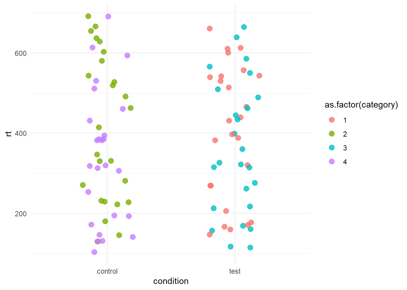
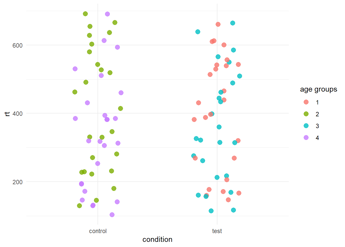
But we want it like this
##E3.
Using the same data set as the previous exercise, try to obtain the following plot.
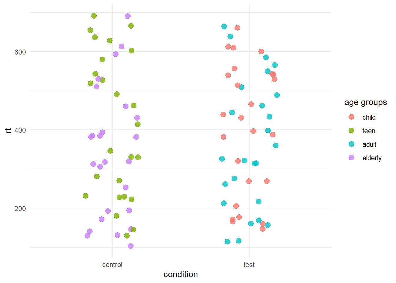
Try to do this in two ways:
- Modifying the plot itself
- Modifying the data set (hint: mutate + case_when)
Solutions
E1
airplanes[ , c("arrive_in", "arrive_time", "passengers")]E2
There are a couple of ways to solve this problem. One way consist in modifying the plot itself using the labs layer. As we have provided a colour parameter in the aes, we can call the same parameter in labs and assign it a different name.
age_data %>%
    ggplot(aes(x = condition, y = rt, colour = as.factor(category))) +
    geom_jitter(width = .2, size = 3, alpha = .8) +
    labs(colour = "age groups")
    theme_minimal()
Another way is to use the scale_colour_discrete layer. ggplot offers different scale layers you can use to modify the axes (eg. the values shown on the x and y axes) or the colours. While building a plot, try typing scale_ and you’ll see different options appearing.
age_data %>%
    ggplot(aes(x = condition, y = rt, colour = as.factor(category))) +
    geom_jitter(width = .2, size = 3, alpha = .8) +
    scale_colour_discrete(name = "age groups") +
    theme_minimal()
Finally, you could also think of modifying the dataset itself. For instance, you can rename the category column to age groups. Then, you need to change that colum to a factor so you don;t have to call it inside ggplot. Here we do all of this by piping the dataset through all the functions.
age_data %>%
    rename("age_groups" = "category") %>%
    mutate(age_groups = as.factor(age_groups)) %>%
    ggplot(aes(x = condition, y = rt, colour = age_groups)) +
    geom_jitter(width = .2, size = 3, alpha = .8) +
    theme_minimal()
OK, ok I cheated a bit…here we have age_groups and not age groups. The reason why is that dealing with column names with spaces can be tricky. Here’s what you would need to to:
age_data %>%
    rename("age groups" = "category") %>%
    mutate(`age groups` = as.factor(`age groups`)) %>%
    ggplot(aes(x = condition, y = rt, colour = `age groups`)) +
    geom_jitter(width = .2, size = 3, alpha = .8) +
    theme_minimal()
E3
Again, we have multiple options here. One is to use scale_colour_discrete as we have shown above. However, here we pass a new argument labels. Note that the new labels must be passed in the correct order you want them.
age_data %>%
    ggplot(aes(x = condition, y = rt, colour = as.factor(category))) +
    geom_jitter(width = .2, size = 3, alpha = .8) +
    scale_color_discrete(name = "age groups", labels = c("child", "teen", "adult", "elderly")) +
    theme_minimal()
If we want to modify the data set itself:
age_data %>%
    mutate(category = case_when(category == 1 ~ "child",
                                category == 2 ~ "teen",
                                category == 3 ~ "adult",
                                category == 4 ~ "elderly")) %>%
    rename(`age groups` = category) %>%
    ggplot(aes(x = condition, y = rt, colour = `age groups`)) +
    geom_jitter(width = .2, size = 3, alpha = .8) +
    theme_minimal()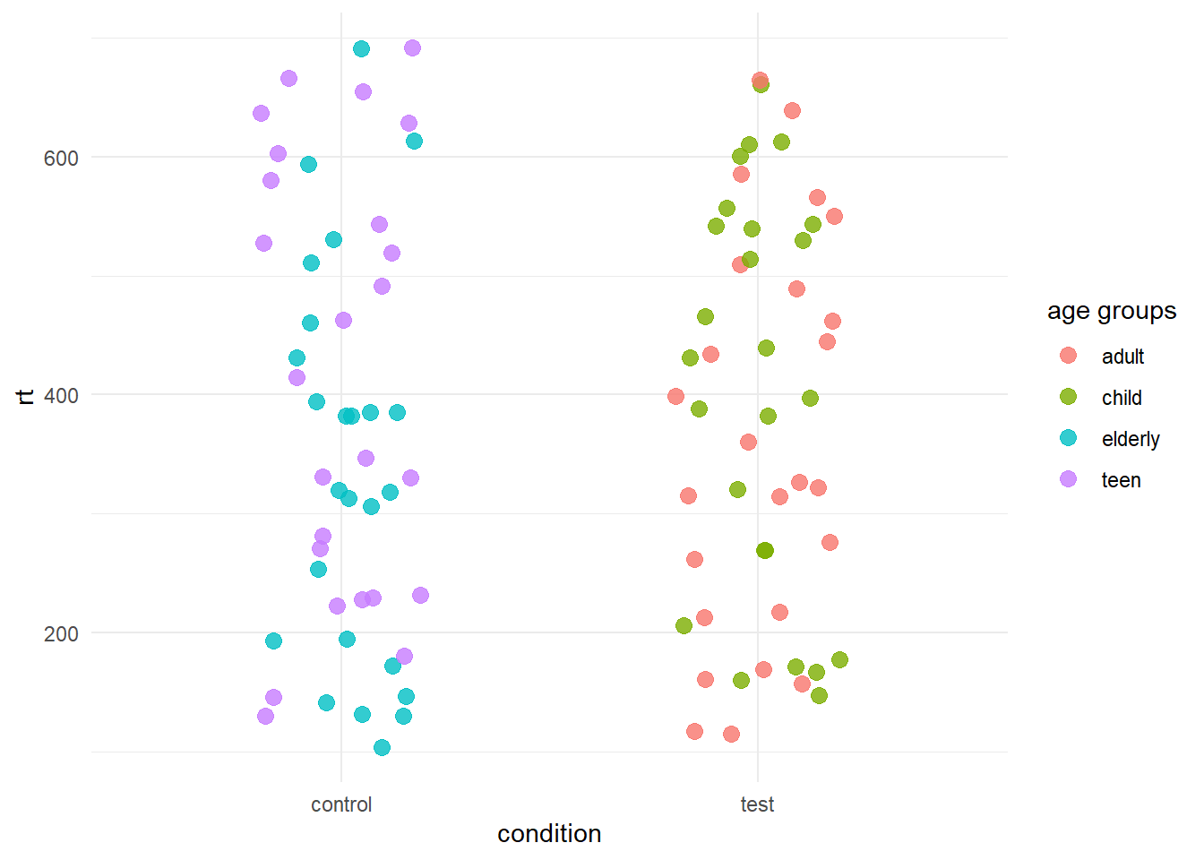
NOTE” the colours might be assigned differently between different methods. However, the groups will reflect always the same points. Also note that geom_jitter jitters the point in a random way, thus every time you plot the data using it, the points will appear in different locations (within their our group).